Looking Backward to Move Forward: Rethinking Typography
The Landscape of Type
We live in a world of words where signs, screens and facades call out to us. Walking down the street, going into shop or entering a building, their words guide, sell, warn and delight us. Whether for advertising or activism, to convey information or for creative expression, from our digital feed to our printed food packaging,the ways in which designers use type has never been more fluid or more diverse.
One can argue that as designers in the museum and exhibition field, we have a specific, and very different, rule book. There are established conventions for the way in which type is used, beyond the important accessibility considerations. The prevailing logic is that typography needs to be somewhat restrained, even invisible.
But, as designers, architects, writers, curators, consultants and artists, we too are human and therefore susceptible to being influenced by a visual landscape that evolves and changes through time. It is essential that we continue to question our assumptions. After all, what are museums and galleries if not a reflection of society’s ever-changing perspectives? To ignore current influences would be to deny the very culture we aretrying to interpret. The challenge is to successfully integrate these trends because museums, like the societies they reflect, are always evolving.
From Place Branding to Exhibition Identity: Typography as Spatial Voice
Within a museum, type and the way it is used must support an exhibition narrative, conveying tone and adding to a storyline. It might be that an exhibition is particularly playful or that it involves quotation or needs to create a calm or reflexive space. In these contexts, typography is a constant lever for mood, meaning and vision in a spatial context.
Within our work we have observed a persisting hesitance to use serif fonts, as it is believed that these are less accessible than their sans serif cousins. On a deeper level, this hesitancy also comes from the fear of being perceived as being backward and ‘looking old’. But is this actually true? Do the public associate serifs with a specific, and exclusive kind of heritage, while sans serifs are always considered modern and inclusive?
The answer is not absolute, and as an assumption it also overlooks the complexity of the design process. The context in which a typeface is used very much determines how it is perceived. As the following case studies from the Nissen Richards Studio portfolio demonstrate, there is not a clear-cut difference in the way that sans serif and serif fonts are being used to convey a sense of the past.
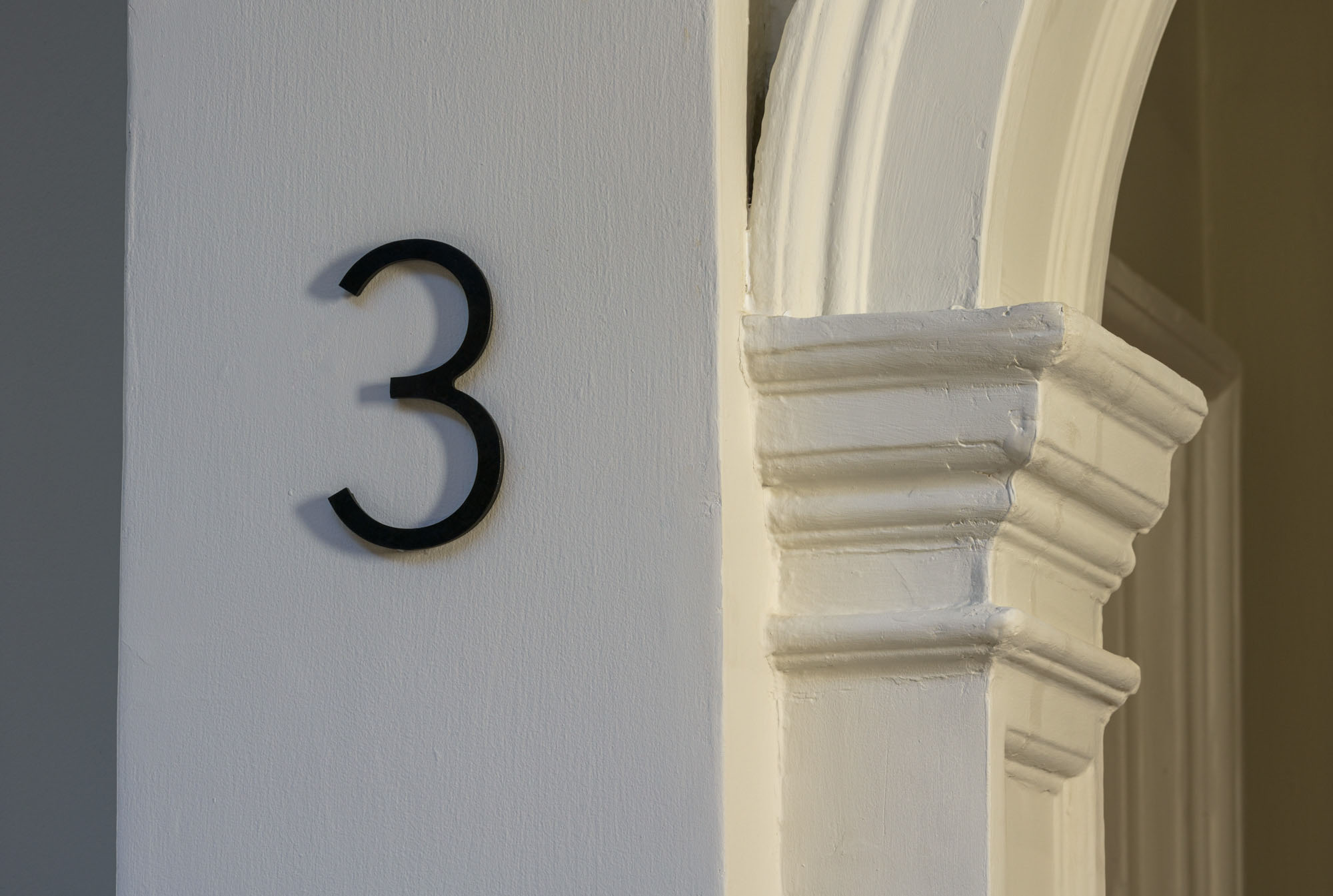
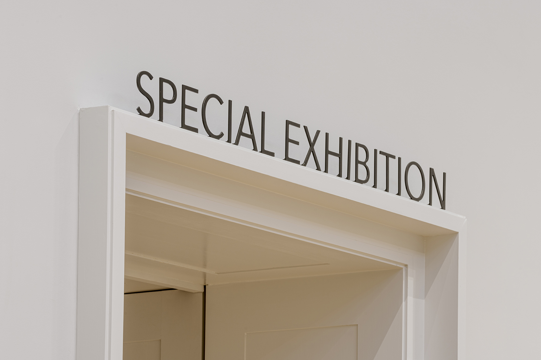
Timeless Modern
Avenir is a geometric sans serif typeface, which we chose for the wayfinding and donor naming for the Courtauld. It’s clean, robust and geometric, with humanist details that help offset the mechanical feel of a typical geometric sans serif type. Designed in the 80s by Adrian Frutiger, Avenir was a modern take on its early-20th-century predecessors. This font needed to exist seamlessly within the neoclassical space of Somerset House. To achieve this, patinated metal cutouts and etchings with a colour fill were applied, subtly bringing in classical, timeless characteristics.
Playful Classic
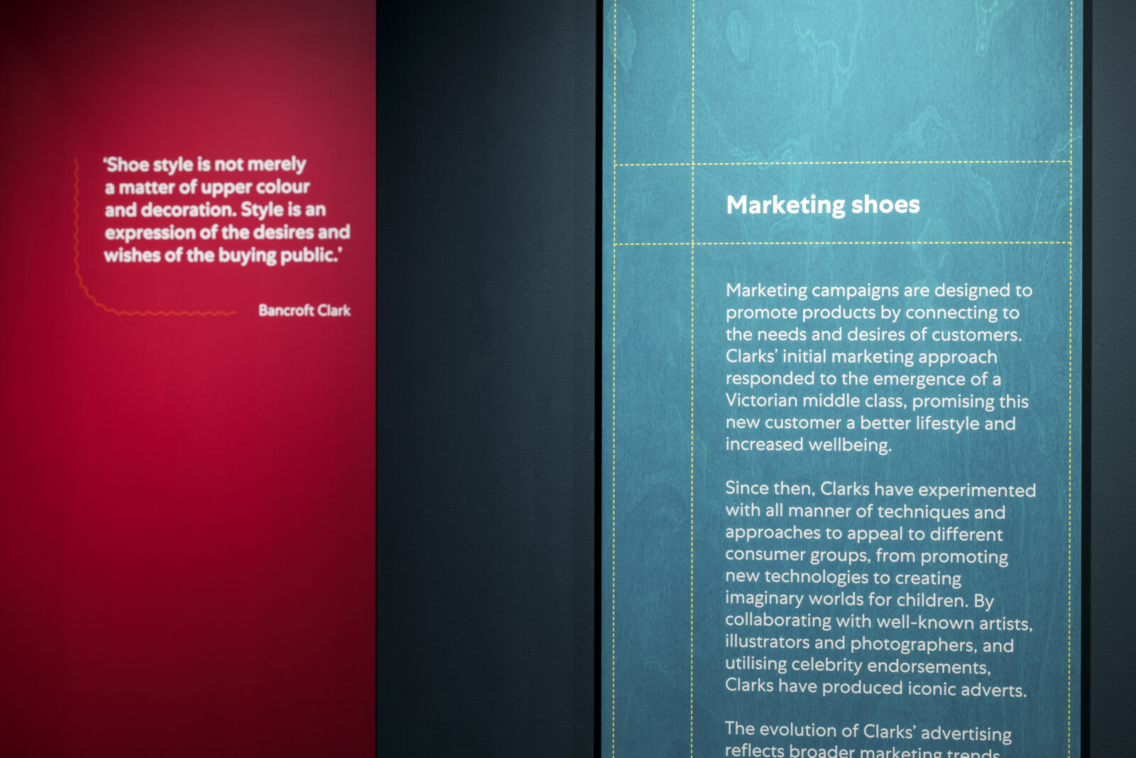
In comparison, Petit Serif and Centra No.1, a serif and a sans serif, were used for the branding and wayfinding for the Shoemakers Museum, which celebrates 200 years of Clarks as a shoemaking company. Both bring a historical look, with Petit a direct reference to classical roman capitals, and Centra heavily influenced by very traditionally British fonts such as Gill Sans. While they reflect the rich industrial history of the Clarks brand, the fonts are integrated into a very modern and lively system of playful colour palette, strong silhouettes and bold graphics.
And Something More
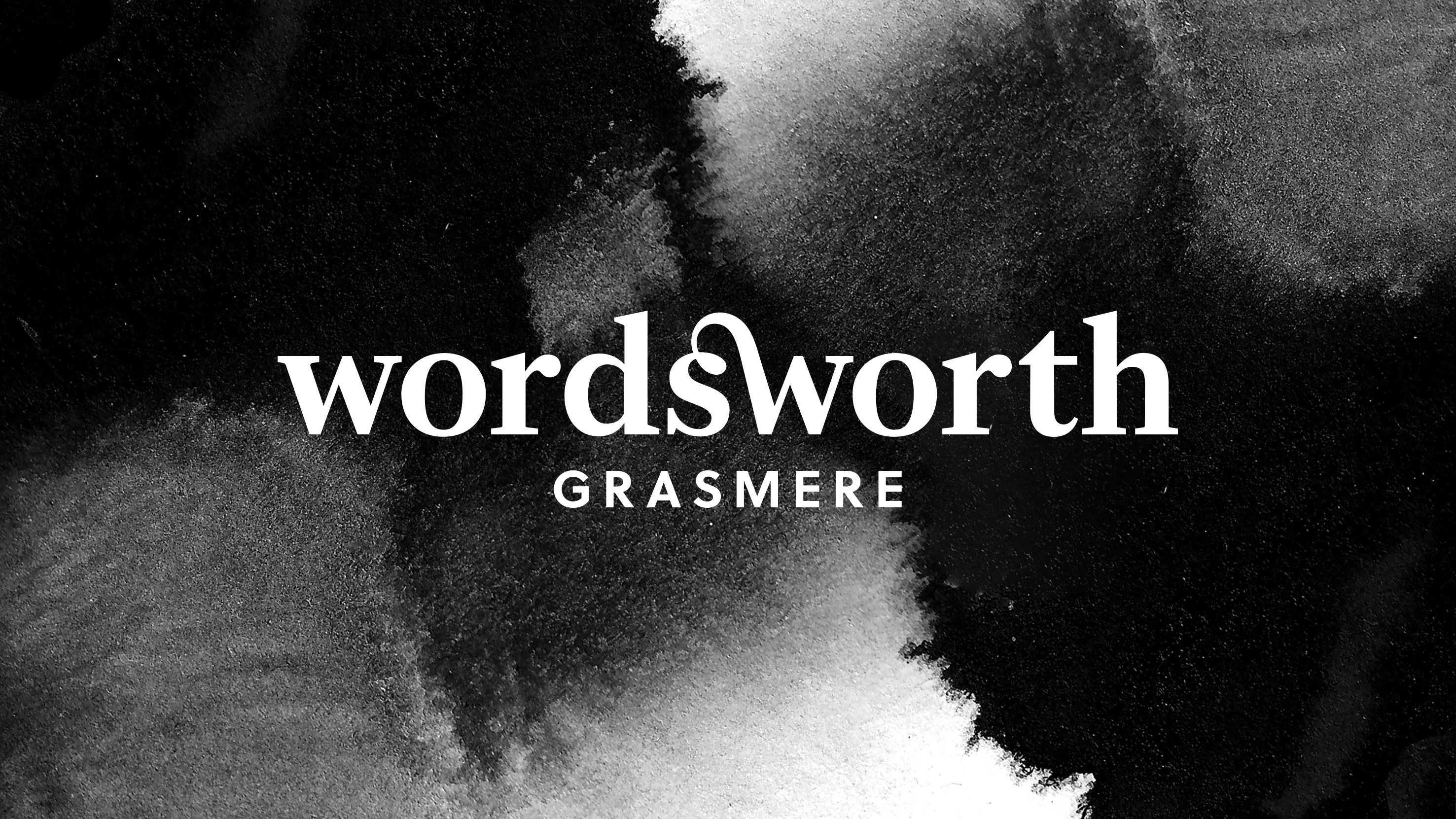
When it comes to creating an identity, small details make big impact. Turning a piece of text into an identity goes beyond the usual typesetting exercise. Customisation is an intricate task, but the effect is tremendous. The logotype for Wordsworth is traditional in the serif font choice and modern in the simplification of the serif details in the letters. However, it is the ligature connecting the ‘s’ and ‘w’ that turns the word into an ownable, memorable, and timeless mark.
Approach to Typography: Questioning the Norm
Within exhibition design, typography is not reserved just for labels and info panels, it is in fact a key part of the visitor journey, an architectural element and a core agent of meaning. An appropriate typeface, or the right pairing of two or more, can help highlight the architectural and historical story of a building or set the scene for an exhibition. How they interact with object display, material choices, modes of engagement and the surrounding architecture is critically important to the exhibition experience. For this reason, choosing and using typefaces is an integrated part of the design process and not an after-thought. The way we choose and use type should be tailored to the specific requirements of the project. Any existing guidelines could not possibly guarantee covering every nuance.
Emerging from the challenges are opportunities and possibilities. What if we use text as images, written words as scenic graphics? What if we use different typefaces to illustrate the variety of narratives or voices within one exhibition? Could a wayfinding system go beyond unified panels to dynamic typographic environments, one that encourages visitors to slow down, explore, or even... enjoy getting lost?
One consideration that illustrates the way forward for typeface design is a need for multilingual text. Design systems need to support multilingual readers by offering expanded character sets. These days, the existing community of type designers is much more diverse and globally connected, bringing more awareness to the imbalance of language availability. Type foundries have been working hard to include a wider variety of scripts and supported languages into their catalogues. Our responsibility is to utilise them, ensure equal presence for all languages, understand the local cultural context wherever we are working, and when appropriate, celebrate them through our design.
The Author