Working with Colour as a Setting for Art
I always particularly enjoy working on projects where we can use colour to help shape the visitor’s journey.
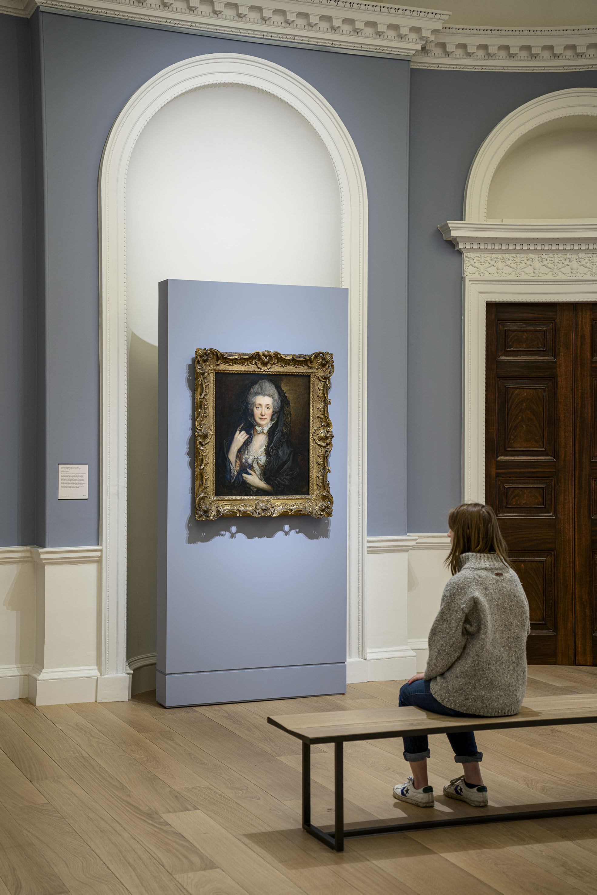
Colour has such a powerful, immediate emotional impact and using colours in a sequence can conjure an atmosphere and set the scene for an exhibition’s narrative development. Whether creating the sense of another time or establishing an immersive atmosphere, colour has the power to transport us. In the detail of the design, colours have additional dynamic characteristics in terms of how they react when placed next to one another – and of course, with the paintings and artworks themselves. Using colour in our exhibition design work is part of a complex jigsaw of components that need to work harmoniously together.
On American Dream, a 1960s print show at the British Museum in London, I remember the curator saying that when you walk into a room of works, the wall colour should contribute by setting the tone and timeframe – but should also be instantly forgettable, so that when you move onto the next room, you don’t just remember the previous room as ‘the blue room’ or ‘the red room’. Rather, the colour should enable the visitor to focus on the works more. I have thought about that a lot since, and, whenever we test colours, I try to strike a balance between atmosphere and background.
When designing an exhibition, we spend a lot of time testing colours to get them right in terms of saturation, tone, and texture. This process is also quite counter to how colour reacts with paintings. Picking a colour from a painting and using this as the overall room colour doesn’t mean that the painting looks better. Usually, in fact, it is quite the opposite. We choose colours instead that resonate and pull the colours of the artworks together, sparking a dialogue.
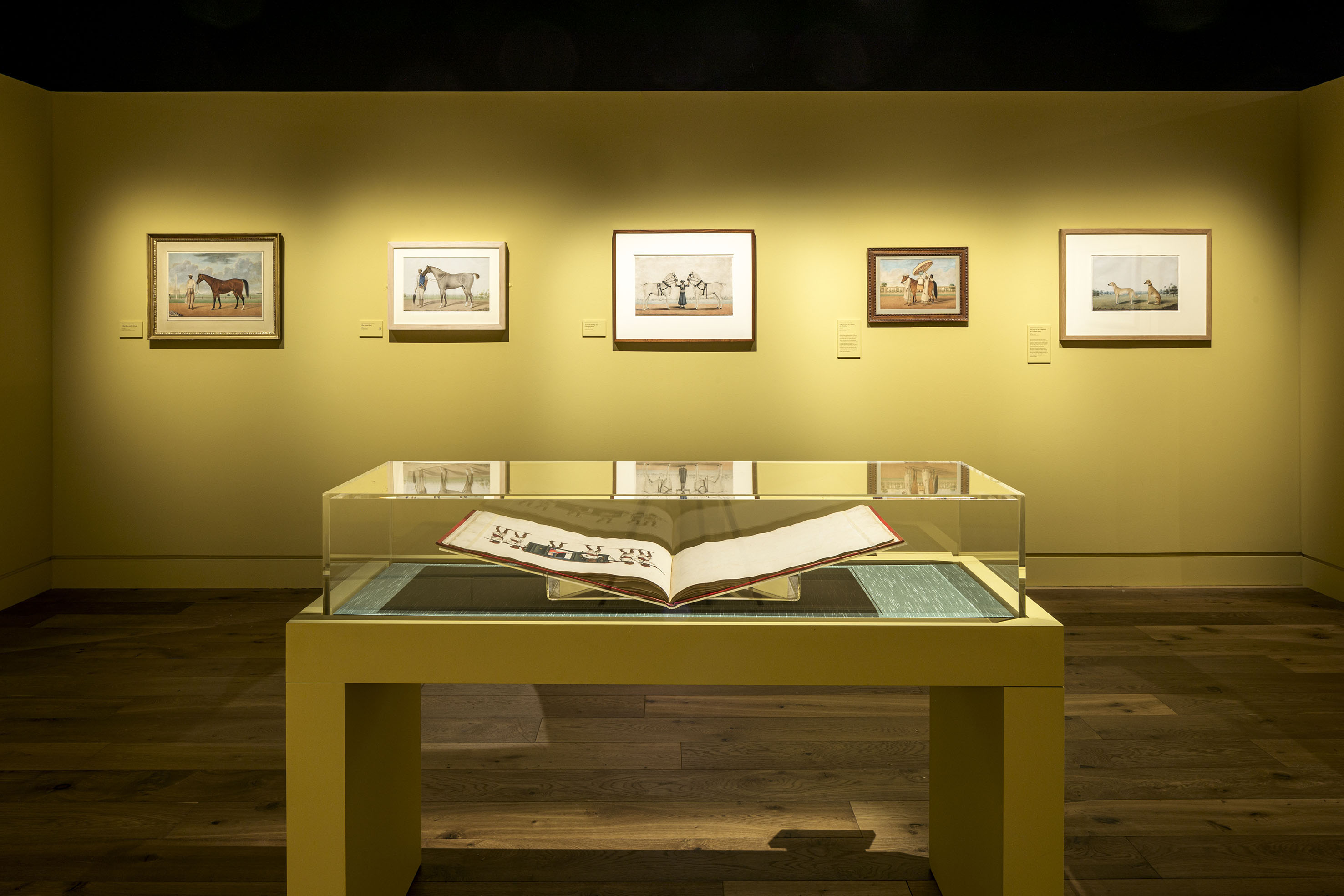
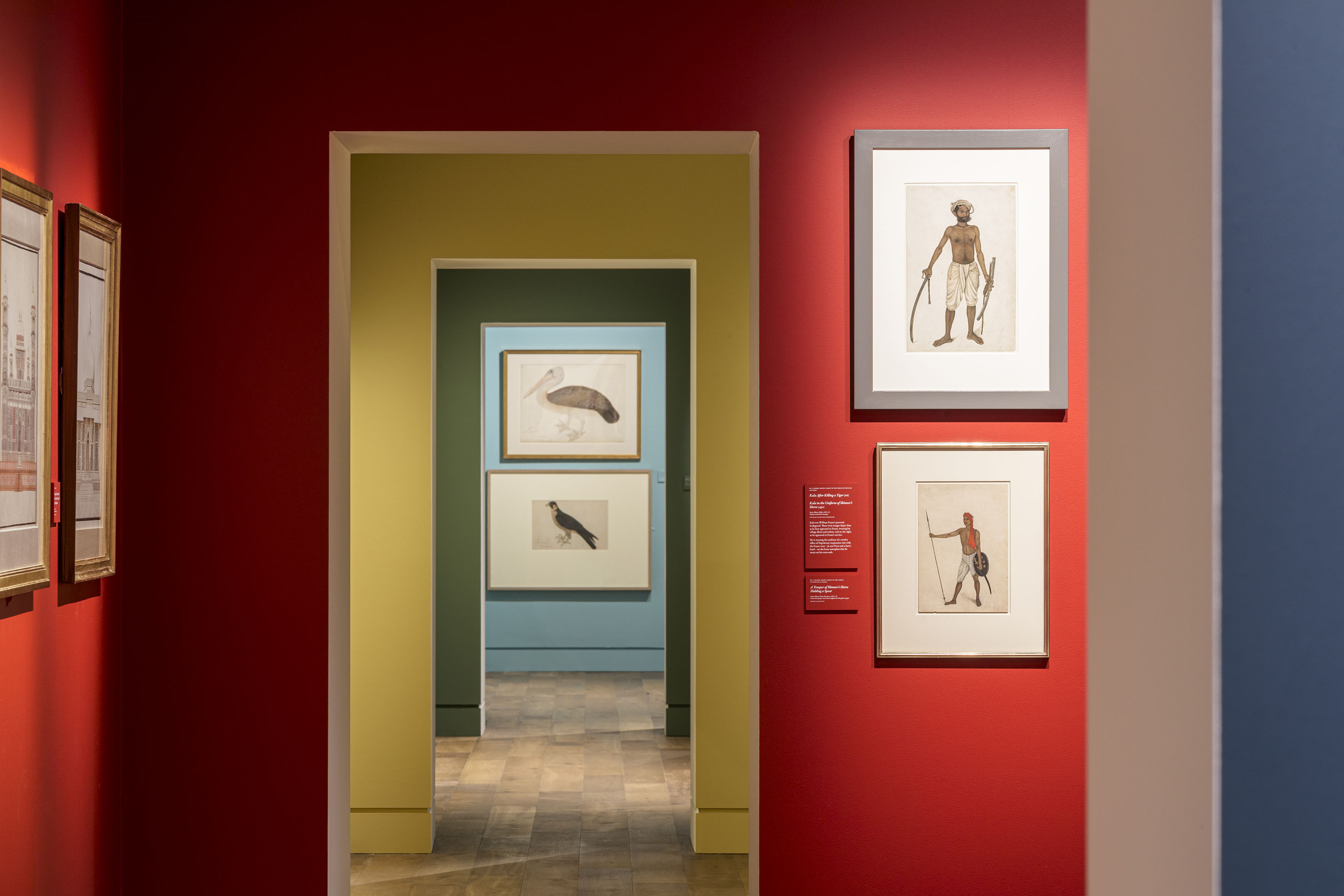
A recent exhibition at the Wallace Collection in London - ‘Forgotten Masters: Indian Painting for the East India Company’ - was a celebration of colour. These were works that had not been shown in a gallery before; intricate paintings, often using a lot of white surrounding the paintings, so the choice of vibrant wall colours allowed the white itself to become ‘held’ and form part of the experience. We created a series of cross walls in the space, each with a doorway through, creating an enfilade that previewed all the colours of the exhibition. We looked to the colours used by architect Le Corbusier to help inspire this choice and the rhythm worked really well, with each room in a complete colour that also ran through showcases. At each threshold the reveals were painted white, so that no two bright colours touched, with the white acting as a purposeful break.
We’re finding colour has made more of a comeback to museums and galleries after the pandemic too, encouraging joyous immersion. For example, in a new exhibition called ‘Playing Pieces’ for the Munch Museum in Oslo, about to transfer to Kode in Bergen, we used colour throughout to create a series of environments for different parts of an art collection, reflecting moments in time and different artists.
The architecture of the space shifted too with spatial configurations changing in a subtly-different way. Colour was used to give a sense of context, either via the artwork period or as an emotional backdrop. There was an overall phrasing through the exhibition too, starting with darker tones, with more spot-lit paintings, and then abruptly flipping to lighter and softer tones, complimented by softer lighting. As the architecture unfolded to a long vista, we jumped again to a bold orange, which signified the centre of the exhibition. This was a section on ‘Female Pioneers’ and the effect was powerful. It felt very confident and bold.
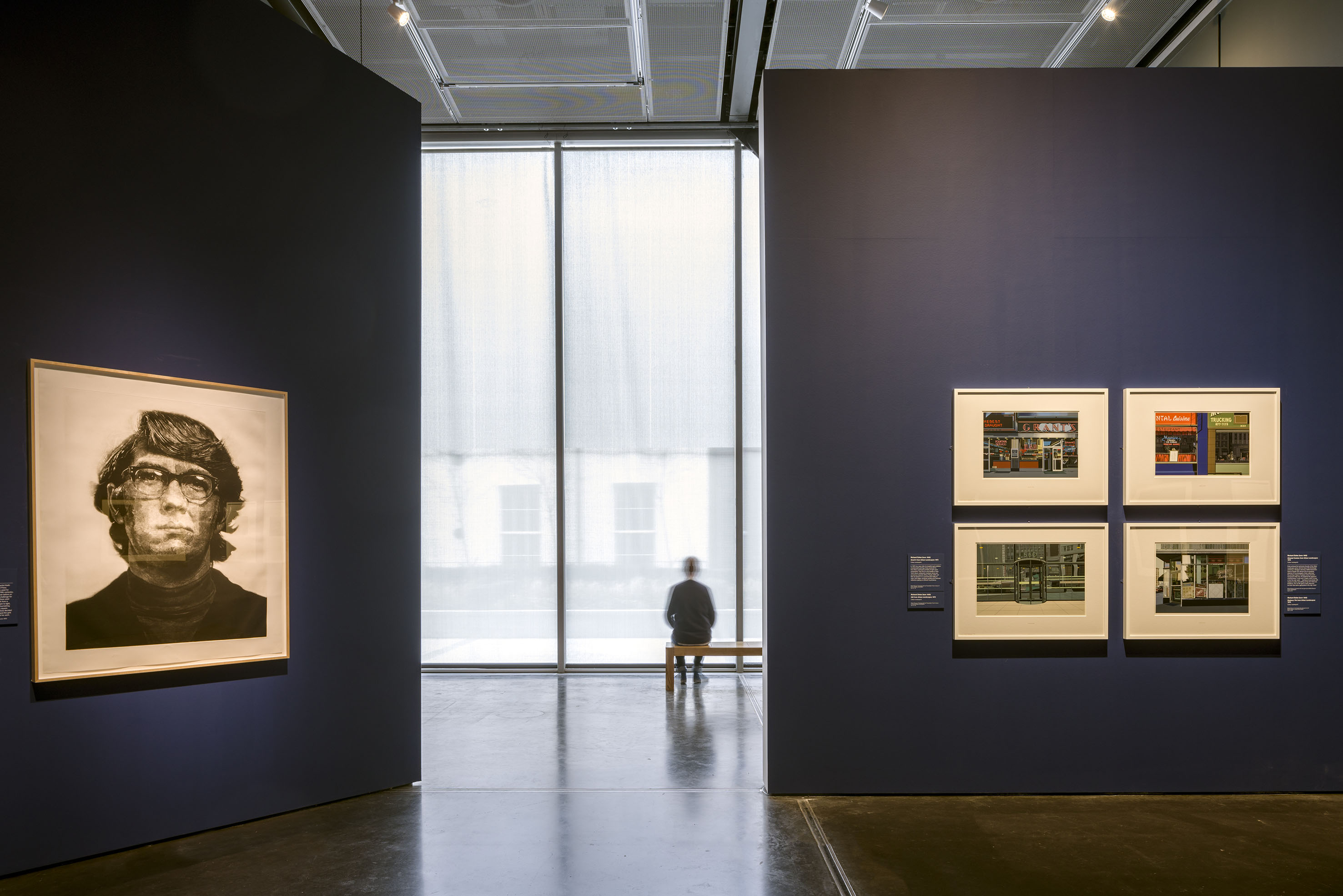
We’ve also had really productive and fascinating collaborations with paint companies in our work where we’ve worked together to create bespoke colours or effects for particular art spaces. For example, during the recent huge-scale refurbishment of The Courtauld Gallery in London, where we created the gallery design – along with the wayfinding, showcases and furniture design - we worked with paint specialists Little Greene and their historic colourist to create bespoke colours for particular rooms. These were subtle but strong at the same time, simplifying the previous colour scheme to enable us to maximise a sense of light as well as respond to the rooms as they went from south-facing - with fantastic views of Somerset House - to north-facing and naturally darker. Part of the solution was to reduce incoming light subtly via black gauze in the windows, so that artificial light could be used in combination with colour to create the perfect viewing conditions for the paintings and artworks on display.
What are the lessons I’ve learnt? That whilst there are no rules, there are right ways to handle colour with art. It’s about ignoring the obvious – colour within the artworks – and creating a narrative story using colour, whether based on feeling, architectural or historical context, that is evocative and in tune – but not dominant. Above all, to be humble and test, test, test to get it right.
A version of this article was published in Art & Museum Magazine, autumn issue 2022
The Author