Creative Access Design - One Solution Doesn’t Fit All
A shorter version of this piece first appeared in ‘Art and Museum Magazine’.
Whenever we design a new gallery or exhibition, it’s important to think about accessibility right from the start - and as part of the creative process. There tends otherwise to be a point in the design process when the client panics and provides a tick box with a list of rules to comply to. But it’s really hard to work like this, as accessibility is a balance of many things – including each individual’s own lived experience.
Techniques that help some people hinders others – for example, a lower showcase may suit children but might exclude older people. What provides excitement for one person might overwhelm others. Another example that particularly highlights this is our continued conversation around barriers of unglazed works at art shows. Some institutions like knee high stanchions, whilst others feel these are a trip hazard. Others still accept a textured floor line, or an alarm. None is the exclusively-correct answer. Some solutions interrupt viewers’ experience or decrease their access. The best solution is non-reflective glass – a perfect result where visitors can get as close as they want to the works - but this is usually too expensive for most institutions and so a compromise is found.
As Heather Pressman and Danielle Schulz write in their book ‘The Art of Access’: ‘Disability is quite complex, and every person is unique; no two people who identify as having the same disability will have the completely same life experiences. Misunderstandings about the experiences of people with disabilities frequently stem from deep-seated and widespread assumptions.’
Our conclusion is that optimal accessible design is about balancing and adapting to try and enable everyone to be included at some point. Testing our designs and starting a dialogue with different users is a vital part of this, before tweaking to adapt. In the process of designing accessibly many times over for major UK institutions such as The National Portrait Gallery, National Trust and The Courtauld Institute in the UK. as well as for international exhibitions in Norway, Iceland, India, Malaysia, the USA and China, here are the six key accessible principles we have devised:
1 - Sensory Spaces
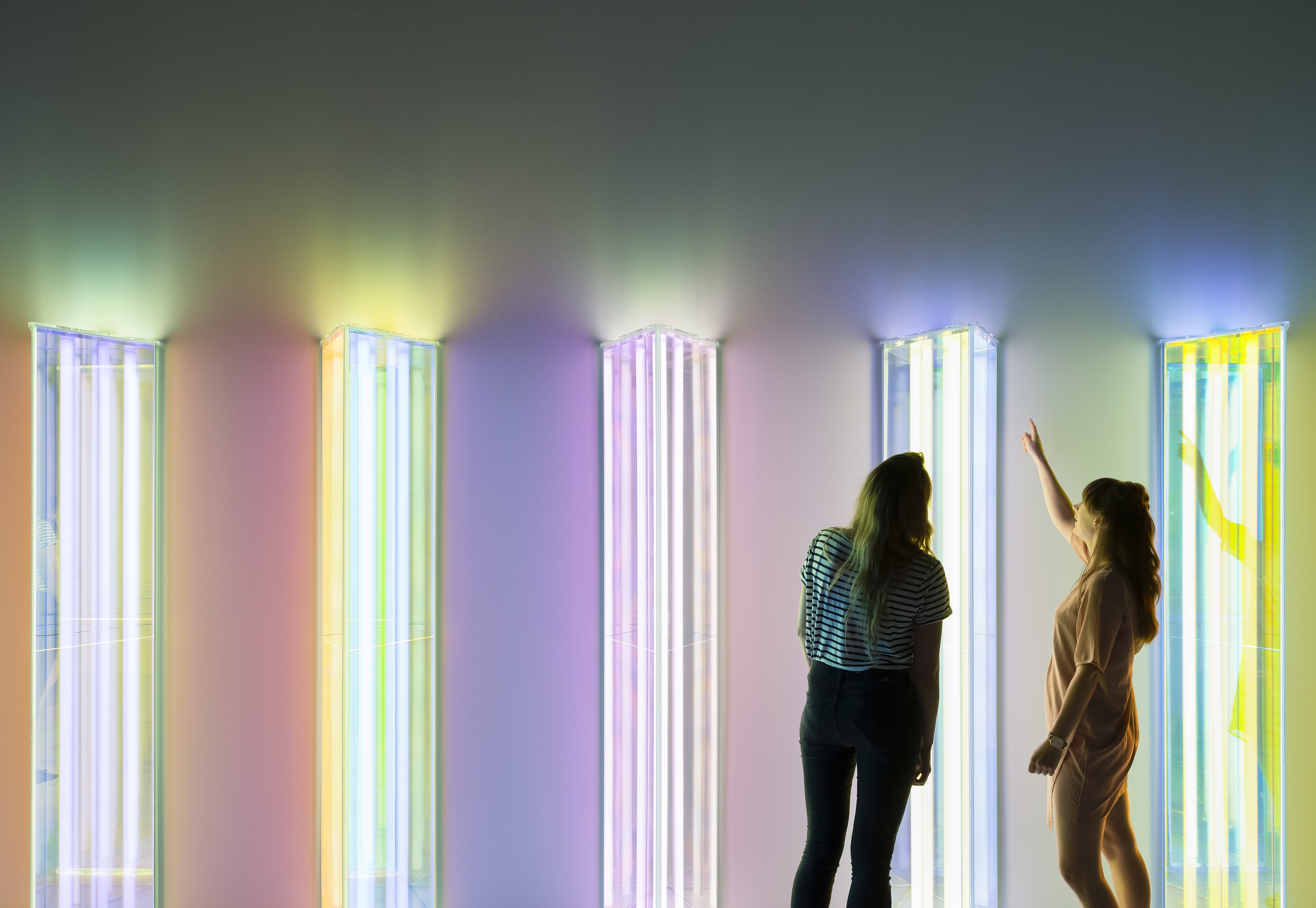
At the beginning of a visitor journey, it’s important to hook people in, so they’re ready to learn. An emotional response really opens people up to engage and feel. For the UK’s Natural History Museum, for example, in a show about the science of colour and mechanisms within the natural world, we worked with artist Liz West to help realise her artwork, in the form of an abstract dichroic installation, encouraging people to identify with the concept of colour in a sensory way before taking in the concept, playing with lights, and seeing colours mix and disappear as visitors move around the space.
2 - Intuitive Experiences
A key aspect of a good cultural experience is not being told what to do, but letting the space tell you, so that the visitor flow feels natural and you don’t feel to be on a conveyor belt walking past a beautiful painting for a matter of seconds. We plan experiences carefully, via computer and physical models, to lead people through spaces using key works on vistas or using light to pin-point and highlight like on a theatre stage. These techniques are especially useful for large institutions with international visitors, where wording can generate not only comprehension issues but can also prove exclusive if those words are ill-considered. Careful juxtapositions, tactile lines on the ground, colours and light are all useful tools for creating a calm and considered space visitors feel in control of.
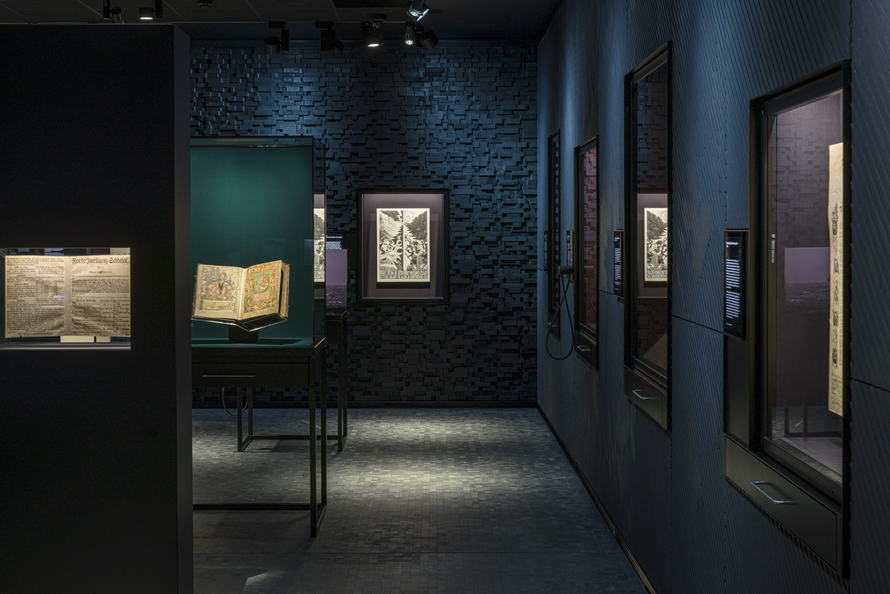
At the National Portrait Gallery, we used colour to lead people on a complex visitor route, to try and give a sense of timeframe of the works, and to link these to a visitor route. The galleries were arranged as a series of enfilades, where we chose a similar colour that could shift through time, and then if you were at a junction with options of where to go next, colours jumped indicating you were crossing time and either moving ahead or moving back.
We believe in painting with light too, so that a lit surface indicates where to go, as a subliminal instruction to follow the light. For the Opplyst project in Oslo, for example, a sequence of light leads you through the show. The title of the exhibition literally means ‘to shine a light on’ and so we wanted to create a very subtle way in which light could guide visitors. The show started with a light box aperture entrance, and then slow timers worked across the space, shifting from cooler to warmer tones, washing light right across and encouraging exploration.
3 – Enabling Technology
There’s a misconception that making something accessible means equalising the experience for everyone. The world we live in is not homogenous, but complex with rough edges and difficult at times. We need to believe in the idea that people will experience works in their own way - and that’s ok – and that technology can be our friend in this.
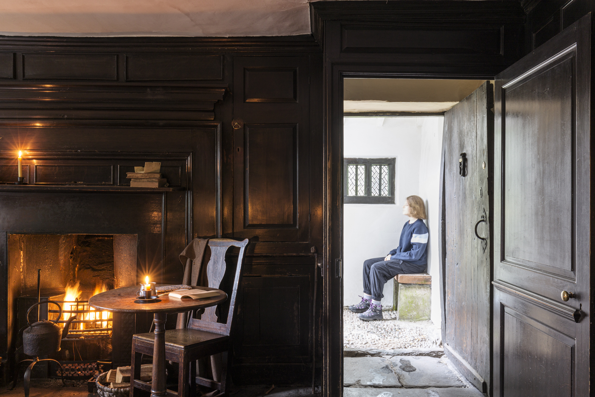
I first came across access consultant Molly Watt, registered Deaf Blind and an advocate for assisted technology and design for those with sensory impairment, when working at Wordsworth Grasmere. We were considering how people would visit Dove Cottage, the great English Romantic poet’s former home in the Lake District, and wanted to create a totally immersive, theatrical experience, as if Wordsworth himself might just be in the next room. The original spaces would have been candle-lit and noisy, full of people in cramped spaces.
Rather than diluting this, Molly helped show how technology could help visually- or hearing-impaired visitors add layers interpretation without changing the fundamental idea or drenching everything in overbright light. Working with film-maker Nick Street, we produced a film that captured the historic experience, for example, using actors to tell the story. Visitors would watch or listen to this before going through to more minimal spaces, where the power of imagination could connect the experiences, using sound to augment the narrative. Molly argued that using audio description technologies and iPads or people’s own devices meant they could control their own experience and access all that we were trying to achieve.
4 - Gesture to Detail
We plan our exhibitions and galleries like a musical score, building up ideas slowly, before adding detail and layers. What’s vital is having the right people in the room and their being part of the conversation, so we don’t tackle issues without lived experience being represented. People with disabilities should be the ones leading the conversation about their own interests and needs, a principle summed up in the expression “nothing about us without us.”
That not everyone has to ‘get’ everything is an important part of this thinking. We mitigate this by tracing out and planning different journeys. We think about pacing and stress - and how some spaces are more visually impactful and some more of an aural experience. We say the same things in different ways.
5 - Simplify and Repeat
Sometimes I feel that our job as designers is about tidying up - creating spaces without noise.
However, repetition is also an important principle of accessibility - saying the same thing in different ways and with different emphasis.
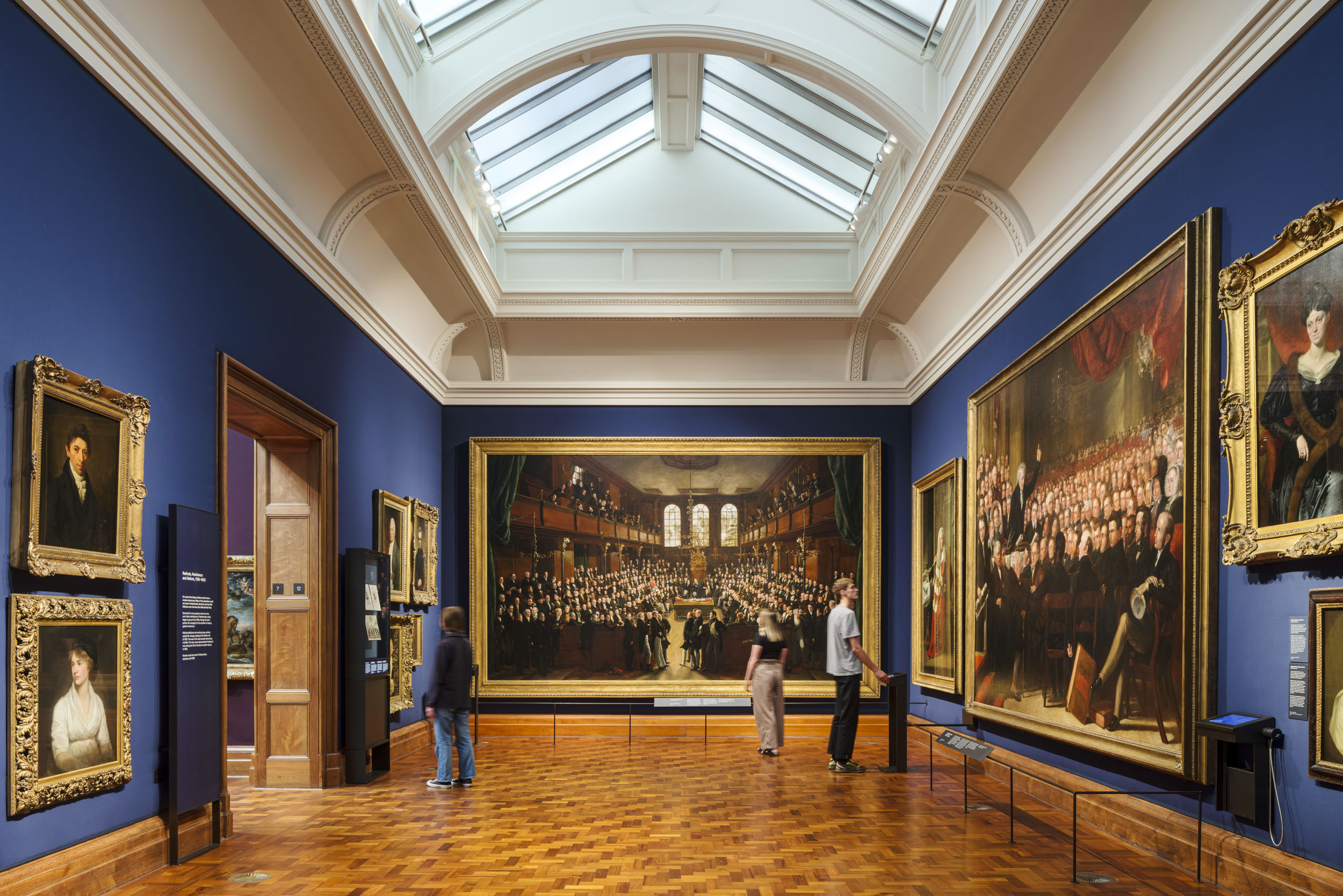
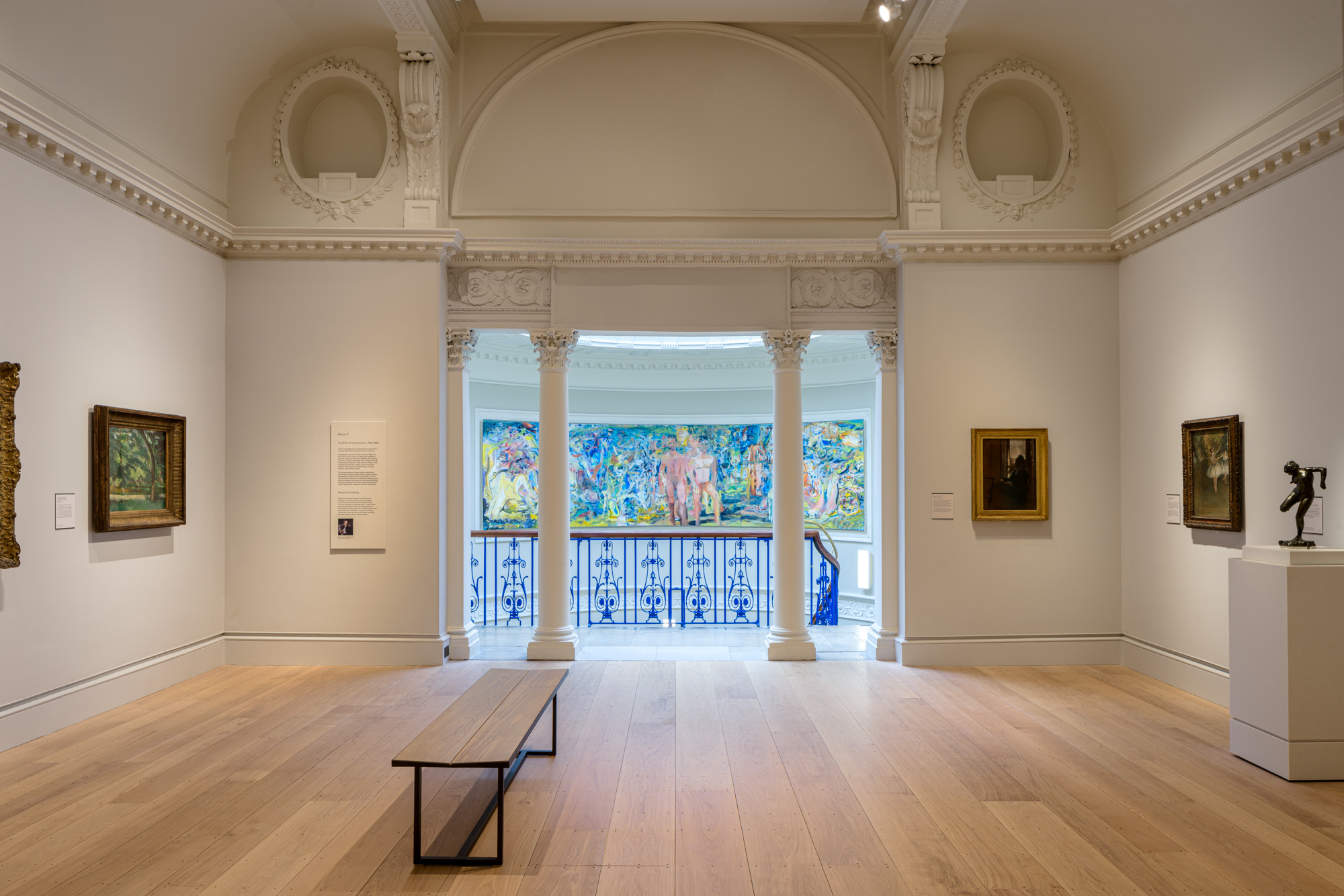
Consistency is helpful. People soon learn to seek out the panel on the left of the door, at the same height, displayed in the same way, and in the same colour. For example, at The Courtauld, we used floating panels and labels – which remain the same colour in every room - and are placed in a similar position in every room.
6 - Testing
The final key is to try things out and open out the discussion. This means accepting the limits of your own voice and experience. Invite people with different experiences to comment - and learn from where you get to. It’s impossible to get it completely right for everyone, but keeping true to the vision and having an open mind to feedback is important.
In the end, good accessible design really is a state of mind. It’s about believing in a process, keeping an open mind, and listening. Try, test, learn – and repeat.
Reading List
- https://blooloop.com/museum/in-depth/accessible-museums-using-technology/
- https://projectlima.co/reimagining-the-future-of-museums/
- https://www.hokforward.com/read/inclusive-design-for-complex-buildings/neurodiversity-the-new-inclusivity/
- https://www.museumnext.com/article/what-are-the-innovations-of-museums/
- https://www.aam-us.org/2022/10/21/museum-accessibility-an-art-and-a-science/
- Heather Pressman and Danielle Schulz ‘The Art of Access’
- Maria Chiara Ciaccheri ‘Museum Accessibility By Design’
The Author