Curating Colour: How Our Perception of Colour Shapes Our Experience

Do we all see colour differently? Why does colour have such a significant impact on our mood? Echo Callaghan, an interpretation specialist at Nissen Richards Studios examines how critical colour is to the visitor experience.
Have you ever tried to describe a colour to someone? If so, you might have experienced the creeping feeling that your vision is subjective. As we try in vain to describe exactly what we can see in objective terms, we end up falling back on other colours, creating hybrid greeny-blues or relying on descriptors that seem vague at best.
But despite its evasiveness, colour is a critical part of our lived experience with the power to affect our mood and wellbeing, impact how we see objects and artworks and even change our behaviour. Some of this colour-confusion comes from the fact that colour itself doesn’t really exist. Instead, ‘colour’ is simply how our eyes and brains make sense of the way light bounces off an object.
Each object we encounter absorbs certain kinds of light waves and reflects others. When this light radiates off an object it hits the retina at the back of our eyes, where there are cells known as rods and cones which can send messages to our brains. Each colour stimulates a specific pattern of rods and cones, allowing us to distinguish between different colours. Objects that we perceive as white absorb no light waves at all, reflecting the full spectrum back at us and objects that we see as black absorb all light waves, reflecting nothing. All other colours are created by the absorption and reflection of different combinations of light in the visible spectrum of wavelengths.
This process explains why we might perceive colour differently to each other. What colour we perceive an object to be is dependent on a process which occurs inside our brain and not everyone’s brains work exactly the same. Consequently, there are many conditions and small genetic variations which impact how we perceive colour. Colour blindness sits at one extreme of this spectrum but our sex, age and other genetic factors can also influence our perception of colour.
But the differences in perception are not just biological. People from sunnier climates tend to prefer brighter, warmer colours than those used to cooler temperatures and tones, suggesting that our environment plays a role in our perception of colour. And in the West we might associate the colour black with death and mourning, but in some parts of the world the colour of mourning is white. These differences in association can affect our perception and understanding of a colour or space.
So if our perception of colour is so subjective, how can we design experiences that speak to a universal audience? There are clearly significant variations in how we perceive colour and being aware of these differences can help us design more inclusive, impactful spaces. Ensuring that our designs don’t use colour combinations that create challenging distinctions for people with colour-blindness and thinking through the cultural associations of our colour choices are basic steps that we can take to create emotive and inclusive experiences.
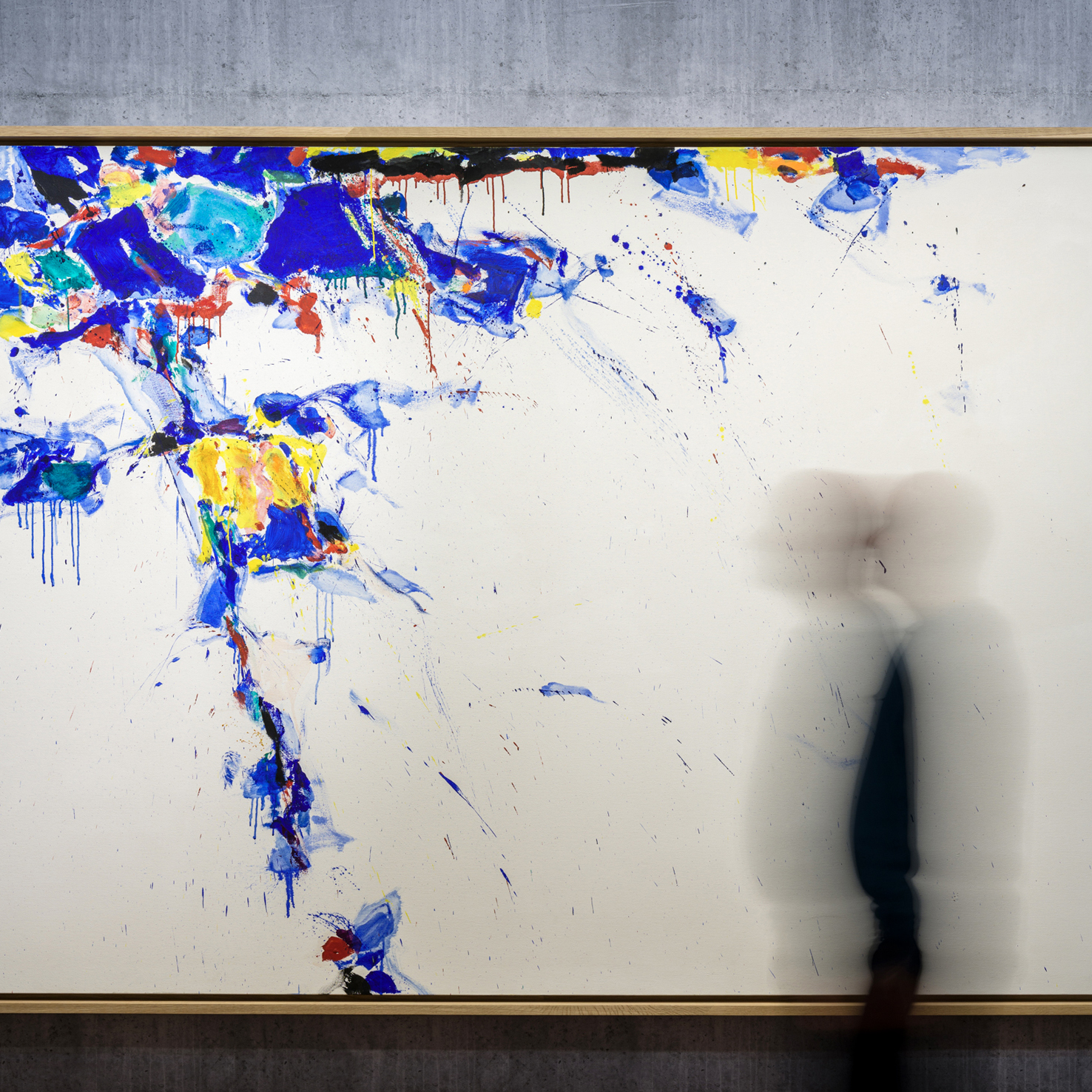
Many contemporary art galleries opt to avoid the discussion of colour altogether, instead choosing to follow the ‘white box’ approach to displaying artworks. Whilst this may allow some artworks to stand out and prevents any design from interfering with the artist’s vision, it can also create spaces that feel clinical and cold. Other galleries are bound to ideas of historical accuracy and are afraid to branch out towards a more vibrant colour palette. But despite these design trends, the benefits of utilising colour are clear and there are some universal principles that can guide our approach to including colour in exhibition spaces.
Colours have the power to attract our attention, helping us have more engaging and memorable experiences. Warm colours such as yellow, orange and are known to boost our memory and we remember images better in colour than we do in black and white. Colour can also arouse an emotive response in us, with colours such as red being almost universally associated with anger and green with more peaceful, positive emotions. For some curators playing with these emotional responses might be beneficial. One exhibition might aim to use colour to inspire a sense of righteous anger, another might aim for cooler, more muted tones to create a sense of calm in the visitor.
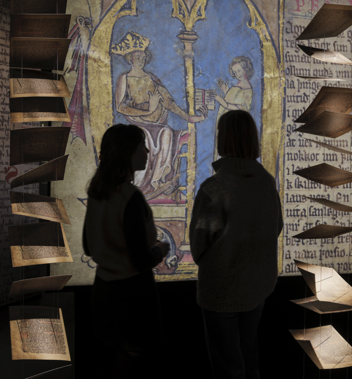
At Nissen Richards Studio, we consider colour a core tenet of our exhibition approach and conduct rigorous testing to ensure that we select the appropriate colour palette for each exhibition we work on. At the Wallace Collection, an exhibition titled ‘Forgotten Masters: Indian Painting for the East India Company’ showcased the first UK exhibition of works by Indian master painters commissioned by the east India Trading Company. To showcase these vibrant paintings, we selected colours from the paintings on display to create a series of bright vistas. Shifts in colour were used to indicate changes in time period, but throughout the exhibition we retained a sense of excitement and stimulation in order to communicate to the visitor the power, richness and importance of these paintings.
Colour was also critical for our design of ‘China’s Hidden Century’ for the British Museum, but the design required a subtler approach. The exhibition featured six separate geographies, each of which was indicated through large-scale graphics, photography and subtle shifts in colour which reflected the subdued palette of the Qing dynasty. Each colour that we selected brought out the objects on display, allowing the visitor’s attention to be drawn softly to the detail of these precious objects as they learned about this tumultuous period in Chinese history.
To create emotive, memorable experiences, colour may be the most helpful tool in the curator’s arsenal. Thinking through the use of colour can help us create more inclusive, universal experiences, retaining the attention of our audiences for longer and making the content of exhibitions more memorable.
Reference list
- Bhana, Yusuf, and Demetrius Williams. “Colour and Culture: Similarities and Differences.” TOPPAN DIGITAL LANGUAGE, 16 Nov. 2018. https://toppandigital.com/translation-blog/colour-culture-similarities-differences/#:~:text=People%20from%20less%20sunny%20climates,to%20mind%20more%20neutral%20toneshttps://toppandigital.com/translation-blog/colour-culture-similarities-differences/#:~:text=People%20from%20less%20sunny%20climates,to%20mind%20more%20neutral%20tones. Accessed 13 August 2024.
- Brogaard, Berit. “Why we don’t see the same colours” Psychology Today, June 2020. Accessed 13 August 2024.
- Cheung, Vien. Colour: Its Influence and Impact on the Way We Live. n.d https://spotlight.leeds.ac.uk/world-changers/colour/index.html. Accessed 13 August 2024.
- Dzulkifli, Mariam Adawiah, and Muhammad Faiz Mustafar. “The influence of colour on memory performance: a review.” The Malaysian journal of medical sciences : MJMS vol. 20,2 (2013): 3-9.
- Goskar, Tehmina. “Psychology of Curating With Colour.” Curatorial Research Centre, 28 July 2021, https://curatorialresearch.com/colour/psychology-of-curating-with-colour/. Accessed 13 August 2024.
- Jones, Nicola. “Do You See What I See?” SAPIENS, 9 Feb 2017, www.sapiens.org/language/color-perception. Accessed 13 August 2024.
- O’Grady, Cathleen. “Sunlight affects whether languages have a word for ‘blue’” Science, 30 Sept. 2021. https://www.science.org/content/article/sunlight-affects-whether-languages-have-word-blue. Accessed 13 August 2024.
- Pantone. “How do we see colour?” Pantone. n.d. Accessed 13 August 2024.
- Turbert, David. “What Is Color Blindness?” American Academy of Ophthalmology, 26 Sept. 2022. https://www.aao.org/eye-health/diseases/what-is-color-blindness. Accessed 13 August 2024.
The Author